Dashboard
The Dashboard is your financial command center, providing a quick overview of your financial health at a glance.
Features
Income & Expense Summary
The top of the dashboard shows your current financial snapshot:
- Total Income - All income transactions for the selected period
- Total Expenses - All expense transactions for the selected period
- Net Income - Income minus expenses (your savings/deficit)
Interactive Charts
The dashboard includes several interactive charts powered by Chart.js:
Monthly Trends Chart
- Line or bar chart showing income vs. expenses over time
- Hover over data points for exact values
- Toggle between monthly and yearly views
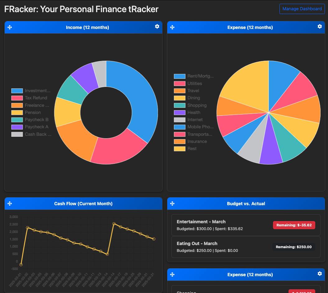
Category Breakdown
- Pie or doughnut chart showing spending by category
- Click on categories to drill down into details
- Customizable number of categories displayed
Recent Transactions
View your most recent transactions directly on the dashboard:
- Last 10 transactions by default
- Quick view of date, description, category, and amount
- Click on any transaction to view details or edit
Time Period Filtering
Use the date range selector to view different time periods:
- This Month - Current month to date
- Last Month - Previous calendar month
- Last 3 Months - Rolling 3-month window
- Year to Date - January 1st through today
- Last Year - Previous calendar year
- Custom Range - Select any date range
Customization
Chart Slices
Control how many categories are shown in your pie chart:
- Navigate to Dashboard Settings
- Select number of chart slices (5, 10, 15, or All)
- Click Save
Categories with the highest spending will be shown, with remaining categories grouped into "Other."
Default View
Set your preferred default view:
- Select your preferred time period
- The dashboard remembers your last selection
- Returns to this view on next login
Quick Actions
From the dashboard, you can quickly:
- Add Transaction - Click the "+" button to add a new transaction
- Import CSV - Navigate to import page
- View Reports - Access detailed financial reports
- Manage Budgets - Check budget status and create new budgets
Understanding Your Data
Color Coding
- Green - Income and positive balances
- Red - Expenses and negative balances
- Blue - Neutral information (transfers, balances)
Budget Progress
If you have budgets set up, the dashboard shows:
- On Track (Green) - Spending is under budget
- Warning (Yellow) - Approaching budget limit (>75%)
- Over Budget (Red) - Exceeded budget limit
Family Accounts
If you're using a family account:
- Dashboard shows combined data for all family members
- Individual transactions can be filtered by user
- Budgets are shared across the family
Tips for Effective Dashboard Use
- Regular Updates - Import transactions weekly for accurate data
- Review Trends - Check monthly trends to spot spending patterns
- Set Budgets - Create budgets to stay on track
- Categorize Properly - Accurate categories lead to better insights
- Use Time Filters - Compare different periods to track progress
Troubleshooting
Charts Not Displaying
If charts aren't showing:
- Ensure you have transactions in the selected date range
- Check that transactions are properly categorized
- Try refreshing the page
- Clear browser cache
Incorrect Totals
If totals seem wrong:
- Verify the selected date range
- Check for duplicate transactions
- Ensure transfers are marked correctly (not counted as income/expense)
- Review uncategorized transactions